Website deep dive: A fresh website for a new future
Showcasing the details of the makeover of the Xata website as we move to our new serverless Postgres offering.
Author
Elizabet OliveiraDate published
Notice the recent changes to our website? We've revamped it to reflect the next major evolution of the Xata data platform, now featuring a serverless Postgres service. This project kicked off in January 2024, and it went live just a few days before our launch week, scheduled from March 18th to March 22nd, 2024.
To embark on this journey, we formed a trio, kind of like the Avengers of website renovations! Alex was our leader, not only assuming the title of product manager but also wearing the capes of a marketeer and UX expert. Monica, our CEO, also decided to join the action, balancing her role as CEO with that of marketing and UX specialist. And then we have Elizabet, the product designer, who put on her unicorn suit and became a designer, developer, and marketeer. Together, we undertook the mission of refreshing the website. With passion in our hearts and coffee in hand, we faced all challenges head-on, from programming puzzles to marketing madness.
During the website makeover, we undertook various tasks, including:
- Refreshing our brand.
- Implementing the technical aspects of the redesign.
- Creating a new messaging.
Along the way, we also made interesting decisions and overcame technical challenges.
Now, let's dive into these topics.
Refreshing our brand
Our brand has undergone some changes. For a while now, we've been working hard to ensure that our brand effectively communicates the following:
- Innovation - We aimed for the website to reflect our identity as an innovative platform.
- Femininity - Recognizing that many tech websites lean towards a masculine aesthetic, we aimed to bring a feminine touch to our brand, promoting inclusivity and diversity in the tech industry.
- Fun - We wanted to infuse our website with a sense of playfulness and lightheartedness, ensuring that visitors feel engaged and entertained while navigating through our platform. This approach helps us break away from the typical seriousness often associated with tech websites, making our brand more approachable and relatable.
As you'll see in the video below, our design choices reflect our brand's growth. The dark background represents innovation, showing we're forward-thinking. Colors like pink and purple adds a "feminine" touch, welcoming diversity in tech. Plus, our playful mascots in the video make sure visitors have fun and enjoy their time on our platform. Together, these elements show what our brand is all about.
Color modes
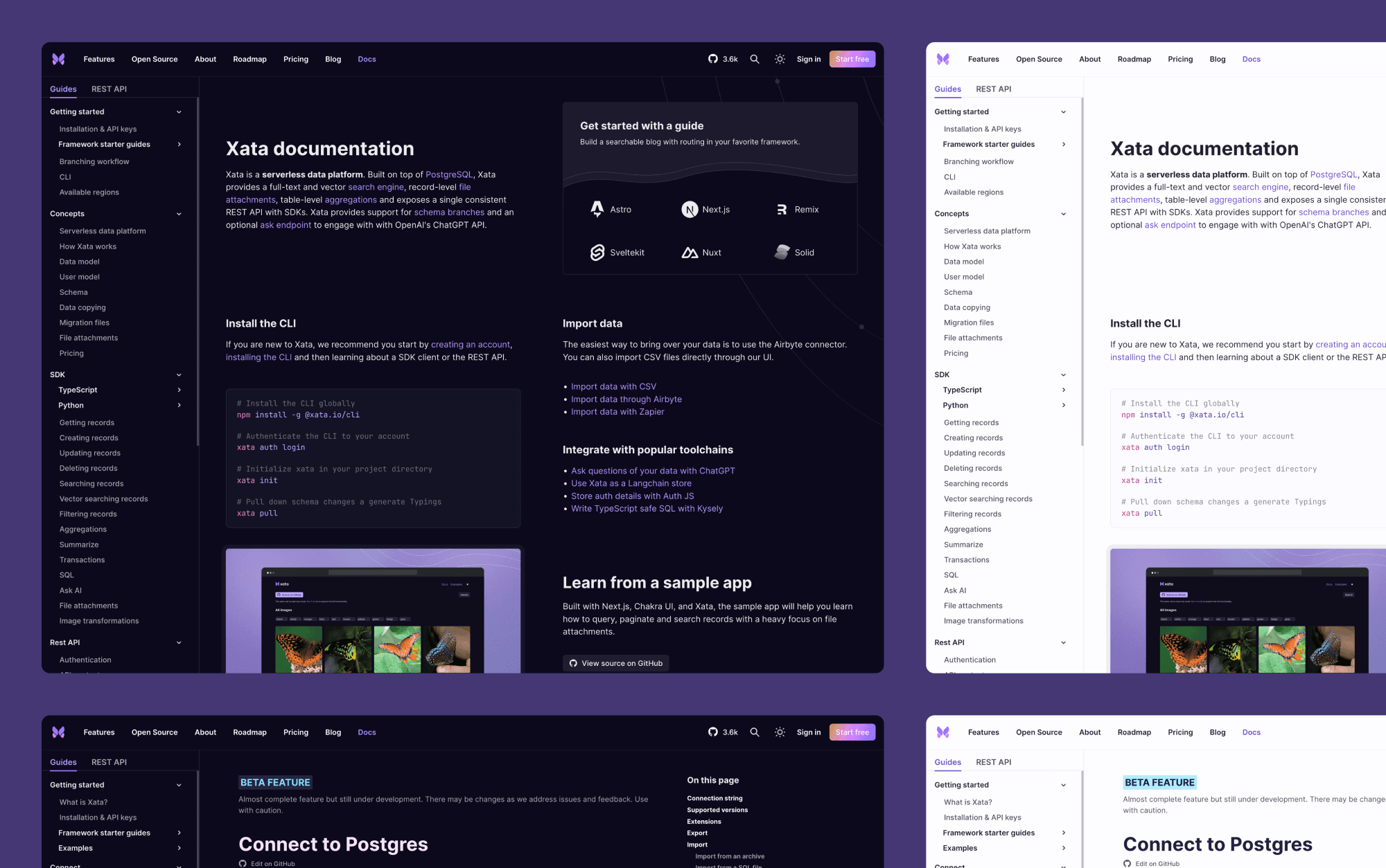
To refresh our brand we did a few adjustments to our color tokens. This had a ripple effect, influencing both our documentation and app. Additionally, we made a bold choice to exclusively design in dark mode, a decision we elaborated on in the "Navigating challenges" section.
However, amidst these changes, we collectively decided to maintain two color modes for our documentation and app, prioritizing an exceptional Developer Experience (DX). This thoughtful decision ensures that our users have the freedom to select the color mode that aligns best with their preferences, thus elevating their overall journey with our platform.
Illustrations
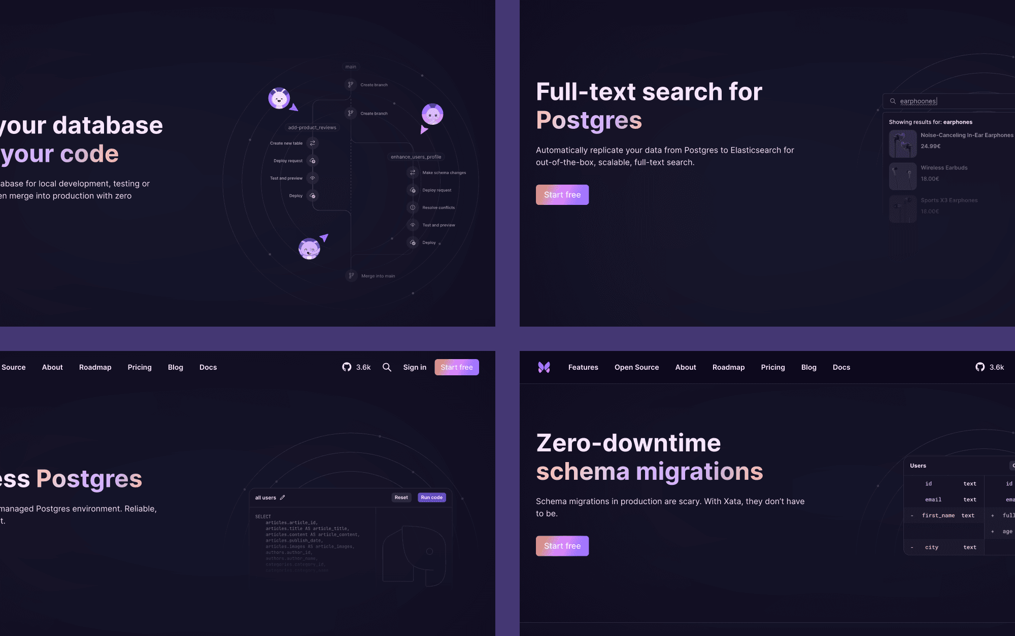
We also introduced new illustrations to our website, which we created using Figma. For each feature page, we designed a unique hero illustration to represent the feature. We opted for a minimalist approach to ensure that the text remains the primary focus.
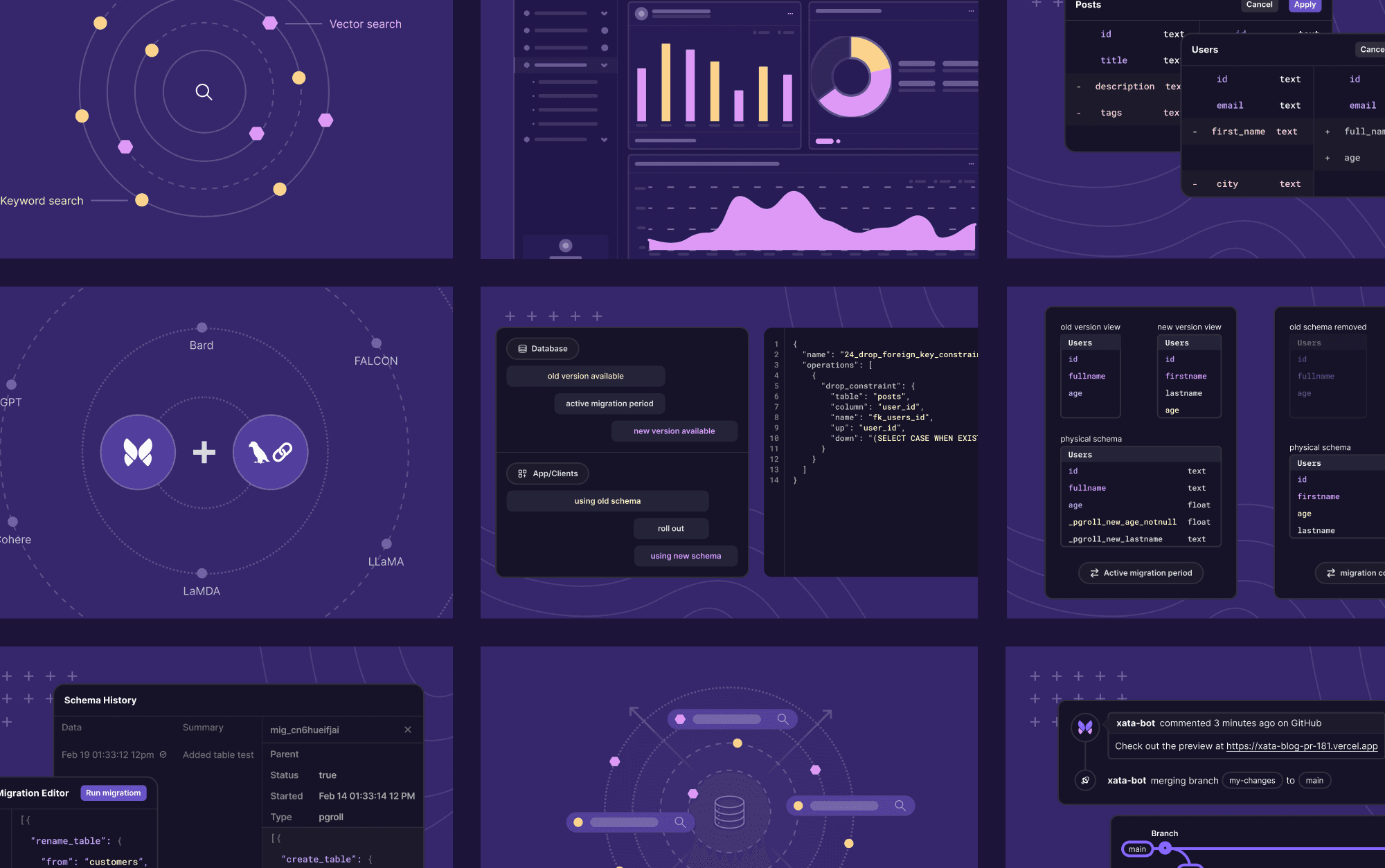
We also created a set of illustrations to represent the different features of our platform.
Embracing fun and welcoming vibes
As I explained earlier, one of the things we were eager to bring with our brand was "fun." We wanted to break away from seriousness a bit. And since our logo is a butterfly, we wanted it to somehow be present on our website and throughout our brand. We wanted to ensure our users felt warmly welcomed and included. That's why we decided to add a bit of fun into the mix without going overboard.
When scrolling through the landing page, you can find some small animations. An example of this is when hovering over the "start free" button, the butterfly emits some hearts. A cute action to show our users that we're happy they're signing up for our product.
Implementing the technical aspects of the redesign
Our website is part of a monorepo where apps are developed using Next.js, a decision we've elaborated on in another post: Using Next.js to improve speed and efficiency at Xata.
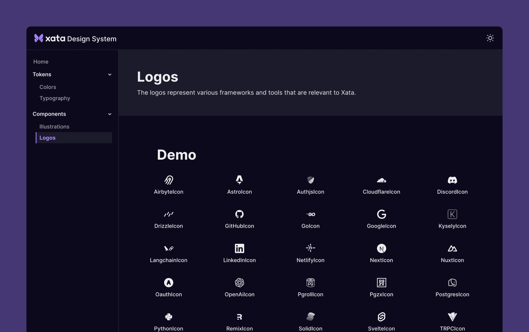
As we implemented the website, we took certain considerations into account. If a component needed to be used across the website, docs, and app, it would be included in our Design System. For instance, the logos. If the component is solely for the website, then it remains within the website scope.
We prioritized ensuring that the site is responsive and achieves good performance, accessibility, best practices, and SEO.
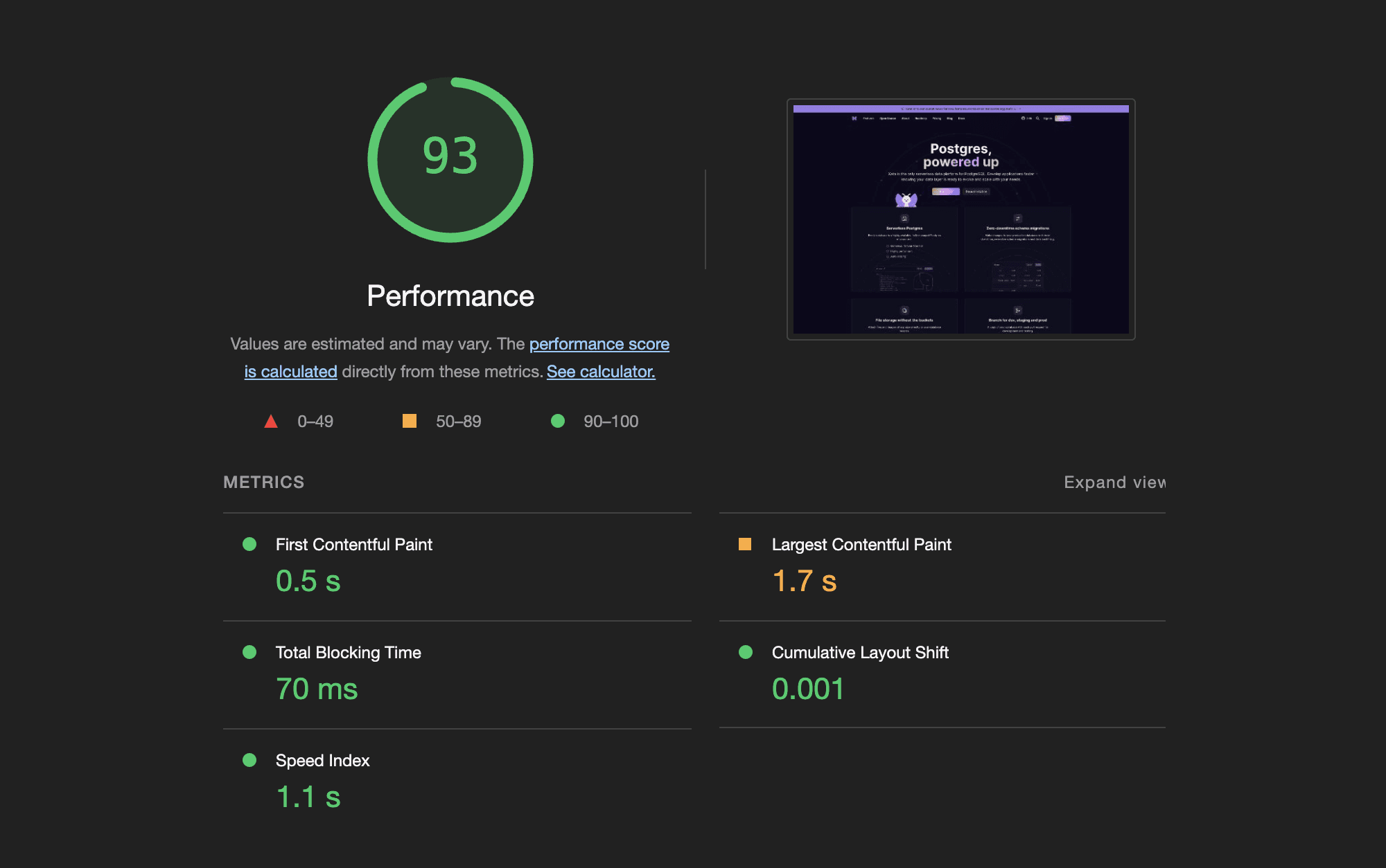
Currently, it's not without its flaws, but at Xata, one of our guiding philosophies is Wabi Sabi, the Japanese concept known as the art of imperfection. We recognize that perfection is not always possible, and we embrace the beauty of imperfection. As time goes on, we'll continue to refine our work while proudly embracing its imperfections.
A good example of this is that our design system is visible to the public: even though it's not perfect. We believe that sharing our work with the community is more important than waiting for perfection.
Creating new messaging
Refreshing our messaging was tough as our aim was to stand out from our competitors and be innovative. Our previous headline, "Serverless database platform powered by Postgres," while descriptive, was similar to our competitors. Could we find something unique? That's when "Postgres, Powered up" emerged.
The process of arriving at the final messaging stage was a lengthy one, which we conducted through Whimsical. Today, we can proudly say we're all Whimsical pros. As you can see in the following image, we assumed the roles of FBI detectives to uncover the narrative.
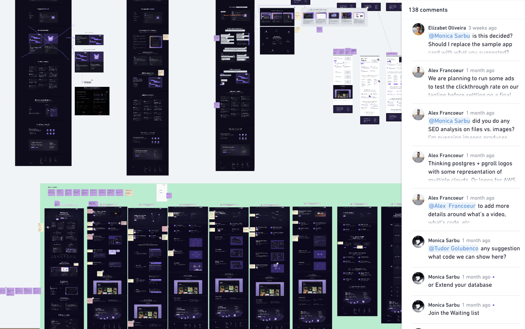
We shared ideas until we found the right messaging to explain our product and its exciting features. We also worked together to come up with illustration ideas that would make our communicating our features even better!
Navigating challenges
Along the way, we faced some challenges, like our TextDistortion animation. This animation uses two SVG filters: FeDisplacementMap and feTurbulence. Unfortunately, due to Safari's limitations, the animation doesn't work properly in this browser.
For those familiar with the previous version of our site, you may recall we had a button to switch between light and dark color modes. Initially, we aimed for a site that focused on both color modes, but in attempting to please both, we found it challenging to meet our goals. Therefore, we decided to focus solely on the dark mode to give a more innovative look to the website.
We faced many other challenges where we had to seek help from more experienced colleagues, such as Cezzaine, who helped refine many of the texts, while Richard and Dave assisted in improving the code.
A bonus page
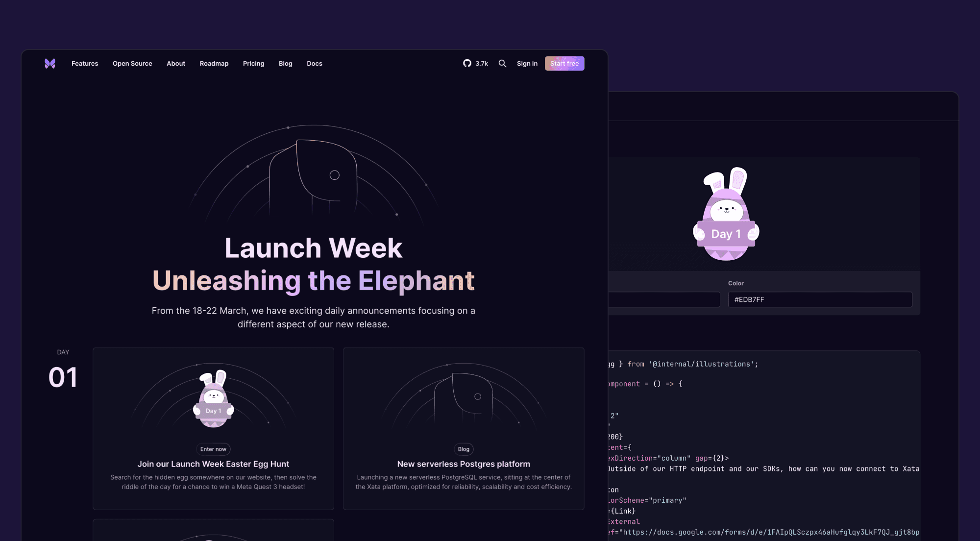
For the first time, we decided to have a custom page for our launch week that we called Launch Week - Unleashing the Elephant. Initially, the idea was to have a simple blog post. However, with a new website design in place, we decided to go a step further and create a custom page for the launch week. Additionally, we decided to create a fun Easter Egg challenge, where we hid 5 Easter eggs with riddles across the website, app, and Discord. The individuals who found them all, would go into a draw to win prizes.
For this challenge, we created a component called the Easter Egg, and because it was intended to be used in multiple projects, we decided to include it as part of the Design System. To use them, we just needed to import the component and pass a few props to customize the text and color. For each day of the contest, we changed the color and text of the egg.
Conclusion
In conclusion, the extensive work on our website involved crafting content for various pages, each playing a crucial role in showcasing our brand and offerings. From the dynamic Landing page to a series of feature pages like File Attachments, Branching, Full text search, Schema migrations, Generative AI, and Serverless Postgres, we meticulously tailored content to engage and inform our audience.
Additionally, we introduced pages for our new open-source projects, including pgroll and pgzx, further expanding our platform's offerings.
Finally, the Launch Week - Unleashing the Elephant served as a focal point for our exciting announcements and initiatives. Together, these pages represent our commitment to delivering a comprehensive and engaging user experience across our entire website.
Learn more
Learn more about the development of our website from the folks that built it, and watch a quick demo to see it in action. Check out our latest meet the makers session here:
Pop into Discord and say hi if you'd like to dig in further 👋
Interested in trying out for yourself? Sign up today! Happy building 🦋